FMCG packaging

Goodees

Packaging and visual direction for a baby-care product range that needed shelf impact, clarity and trust.

BrandingVisual IdentityBrand Messaging

Project summary

A packaging system built to earn trust and stand out at the moment of choice.

BrandingVisual IdentityBrand Messaging

The packaging direction needed to be immediately readable, emotionally warm and commercially clear. The work brought together brand cues, product benefits, size variation and shelf presence in a single flexible system.

It shows how design can make a product easier to choose, even when the customer is making a quick comparison.

Goodees baby-care packaging range shown across product sizes

Project detail 01

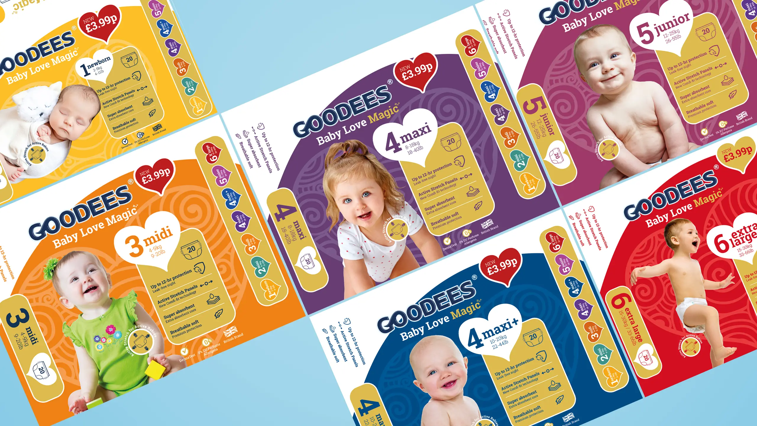
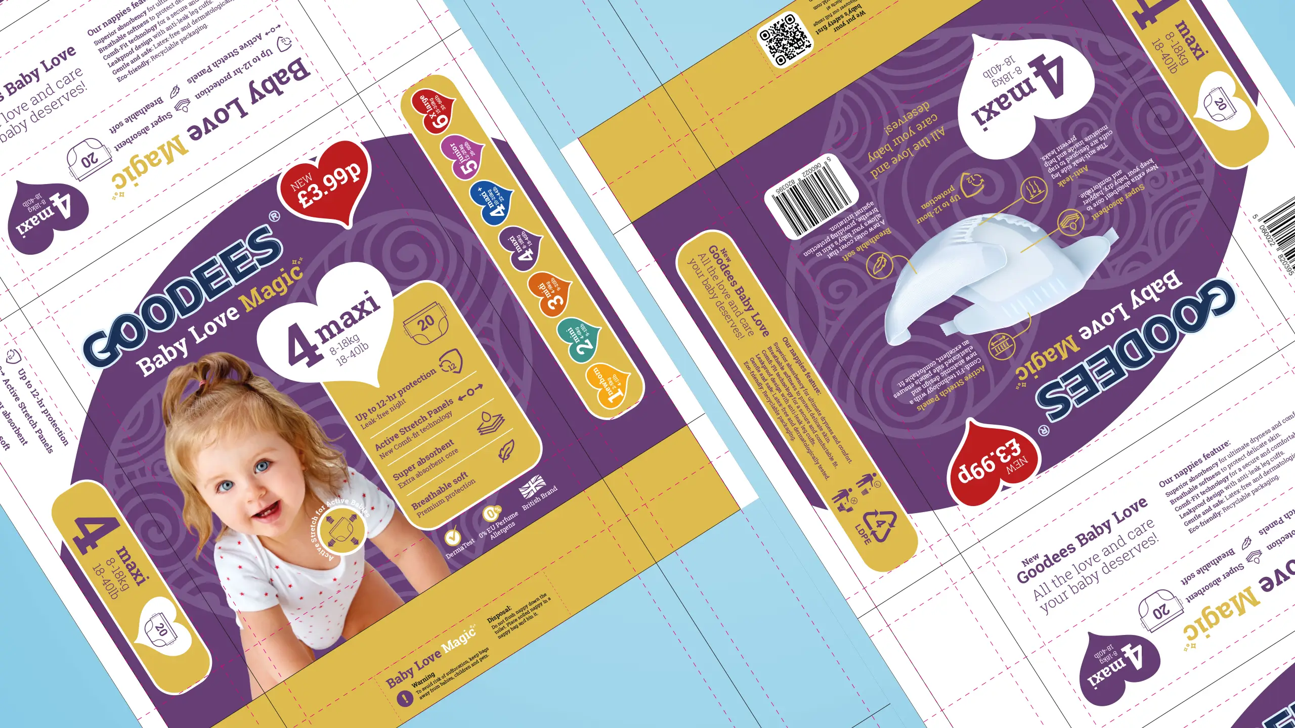
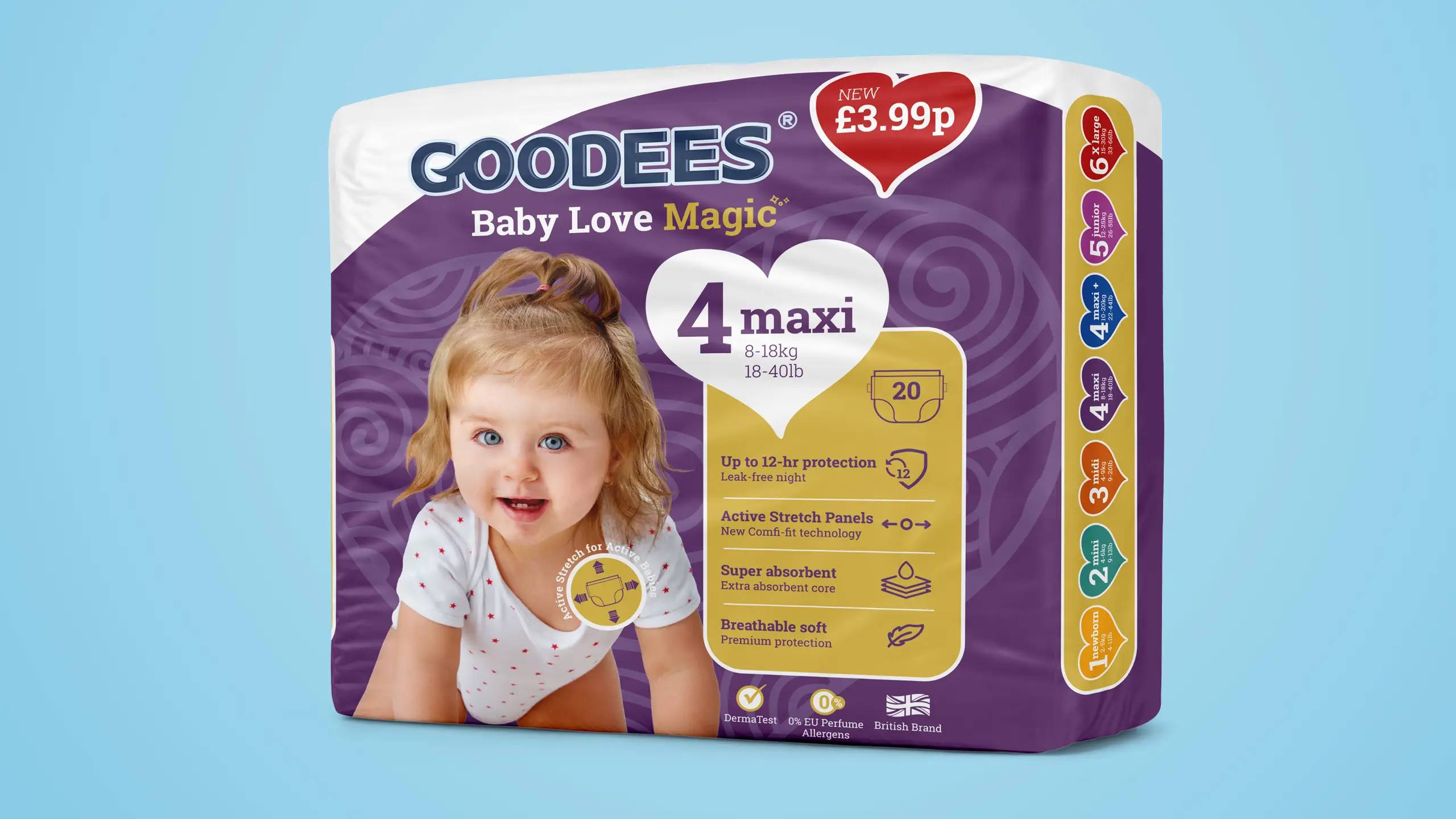
Goodees needed packaging that worked hard in a competitive retail environment. The brief was to create a visual system that felt emotionally warm, commercially clear and immediately readable - giving the range shelf presence without sacrificing the trust cues that matter in the baby-care category.

Goodees packaging detail showing brand identity and product information hierarchy

Project detail 02

The design brought together brand cues, product benefits and feature hierarchy in a single flexible system. Colour, typography and layout were treated as tools for communication first - every element earning its place by making the product easier to pick up, read and choose.

Goodees product variants showing packaging system across the range

Project detail 03

The system was built to stretch across variants without losing recognition. Each size and product type fits the same visual logic, so the range reads as a family on shelf rather than a collection of one-offs. It shows how considered design can make a product easier to choose, even in a quick comparison.

Next step

Want this level of clarity around your offer?

Book a call and we will look at where your message, website or campaigns could be made easier to understand.